Responsive Mobile Design
Ensure your website looks perfect on every device with our mobile-first design approach
The Mobile-First Revolution
In today's digital landscape, mobile devices have become the primary gateway to the internet. With over 60% of web traffic now originating from smartphones and tablets, having a responsive website isn't just an option—it's a necessity. At Smoobu Design, we understand that your website needs to deliver an exceptional experience regardless of how your visitors access it.
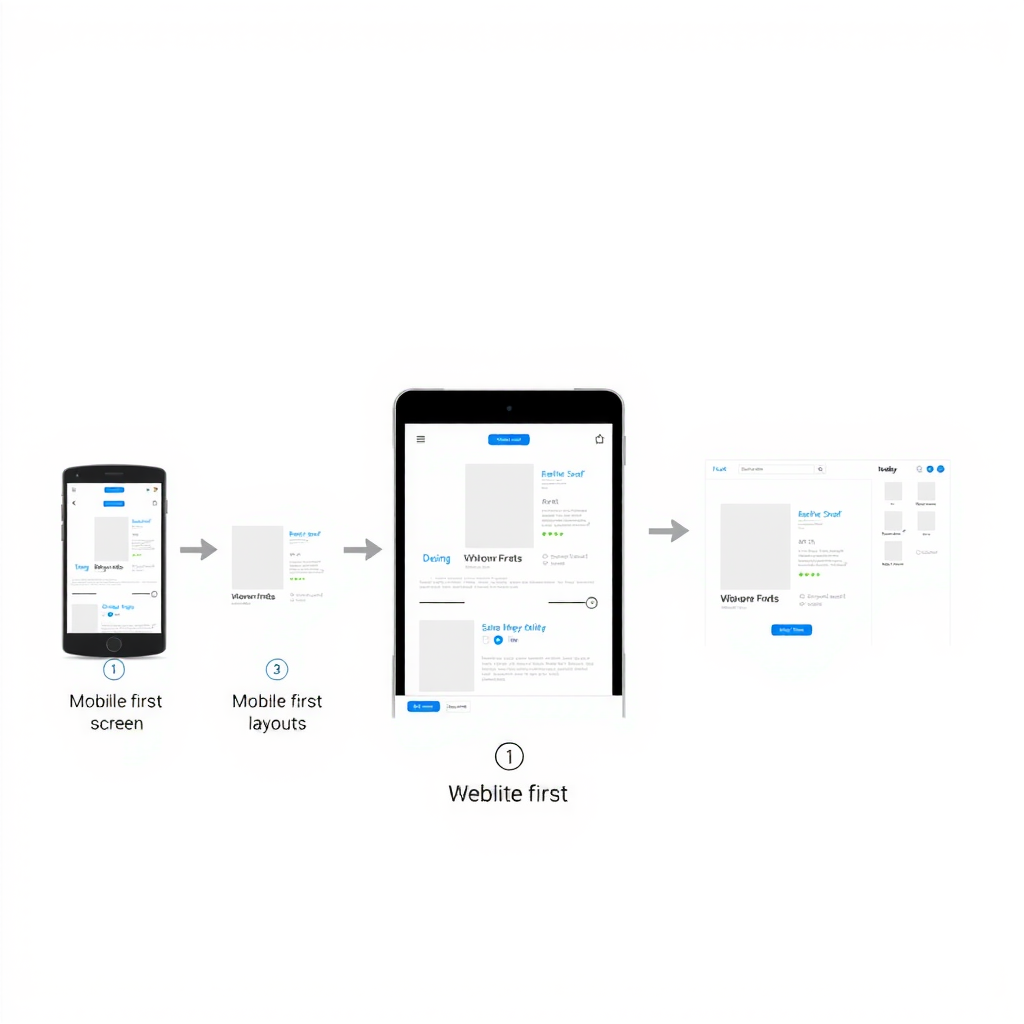
Our mobile-first design philosophy means we start by creating the perfect experience for smartphone users, then progressively enhance it for larger screens. This approach ensures that your website performs flawlessly on every device, from the smallest mobile phone to the largest desktop monitor.
Why Responsive Design Matters
- Mobile traffic accounts for over half of all web visits worldwide
- Google prioritizes mobile-friendly websites in search rankings
- Users expect seamless experiences across all their devices
- Responsive design improves conversion rates and user engagement
- A single responsive site is more cost-effective than maintaining separate mobile and desktop versions
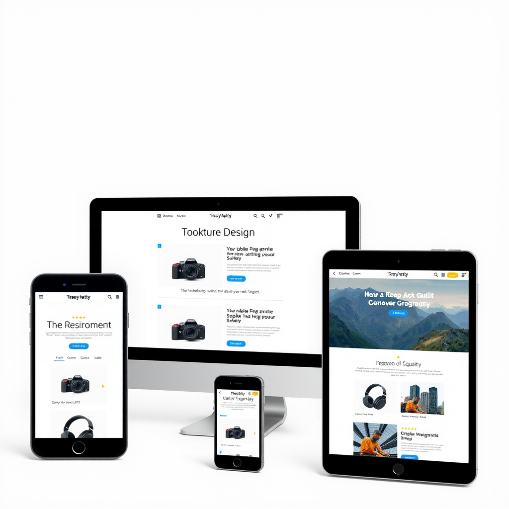
Our mobile-first approach ensures optimal performance on all devices
Adaptive Layouts That Work Everywhere
Our responsive designs automatically adapt to any screen size, ensuring your content is always presented in the most effective way. Whether your visitor is browsing on a 320-pixel-wide smartphone or a 4K desktop monitor, your website will look stunning and function perfectly.
We carefully consider every breakpoint, adjusting layouts, typography, images, and interactive elements to provide the optimal viewing experience. Navigation menus transform into mobile-friendly formats, images scale appropriately, and content reflows to maintain readability and usability across all devices.
Touch-Optimized Interface
All interactive elements are designed with touch in mind, featuring appropriately sized buttons and tap targets that work perfectly with fingers of all sizes.
Lightning-Fast Performance
We optimize images, code, and resources to ensure your website loads quickly on mobile networks, keeping visitors engaged and reducing bounce rates.
Seamless User Experience Across Devices
The beauty of responsive design lies in its ability to provide a consistent brand experience while adapting to each device's unique characteristics. Your visitors can start browsing on their phone during their commute, continue on their tablet at home, and complete their purchase on their desktop at work—all with a seamless, familiar experience.
We pay special attention to navigation patterns, ensuring that menus are easily accessible on mobile devices while taking advantage of the additional screen real estate on desktops. Forms are optimized for mobile input with appropriate keyboard types and validation, while desktop users benefit from enhanced layouts and additional features.

Future-Proof Design Strategy
Technology evolves rapidly, with new devices and screen sizes emerging constantly. Our responsive design approach ensures your website is ready for whatever comes next. Whether it's foldable phones, ultra-wide monitors, or devices we haven't even imagined yet, your website will adapt gracefully.
We use modern web standards and progressive enhancement techniques to build websites that work today and will continue to work tomorrow. This forward-thinking approach protects your investment and ensures your online presence remains effective for years to come.
Key Benefits of Our Responsive Design Service
Improved search engine rankings with mobile-friendly design
Higher conversion rates across all devices
Reduced bounce rates and increased engagement
Cost-effective single website solution
Easier maintenance and content updates
Future-proof design that adapts to new devices
Never Miss an Opportunity
In today's competitive digital marketplace, every visitor counts. A website that doesn't work properly on mobile devices means lost opportunities, frustrated users, and potential customers turning to your competitors. With mobile traffic continuing to grow year after year, ensuring your website provides an excellent mobile experience isn't just good practice—it's essential for business success.
Our responsive mobile design service ensures that whether your visitors find you through a Google search on their phone, click a link on their tablet, or visit your site from their desktop computer, they'll have a positive, engaging experience that encourages them to take action. Don't let a poor mobile experience cost you valuable business opportunities.
Ready to Reach Every Visitor?
Let Smoobu Design create a responsive website that looks perfect on every device and captures every opportunity. Your business deserves a website that works as hard as you do, no matter how your customers choose to connect.