How Smoobu Design Increased Client Conversion Rates by 340%
Published on December 3, 2024
When a mid-sized e-commerce retailer approached Smoobu Design with declining conversion rates and an outdated website, we knew we had an opportunity to demonstrate the transformative power of strategic design thinking combined with user experience optimization.
The Challenge
Our client, a specialty home goods retailer with annual revenue of $2.3 million, was experiencing a troubling trend. Despite steady traffic growth, their conversion rate had plateaued at 1.2%, well below the industry average of 2.5% for e-commerce sites. Their website, built five years prior, suffered from several critical issues:
- Slow page load times averaging 6.8 seconds on mobile devices
- Confusing navigation structure with products buried three clicks deep
- Poor mobile experience with tiny buttons and unreadable text
- Checkout process requiring seven steps with no progress indicators
- Lack of trust signals and social proof throughout the customer journey
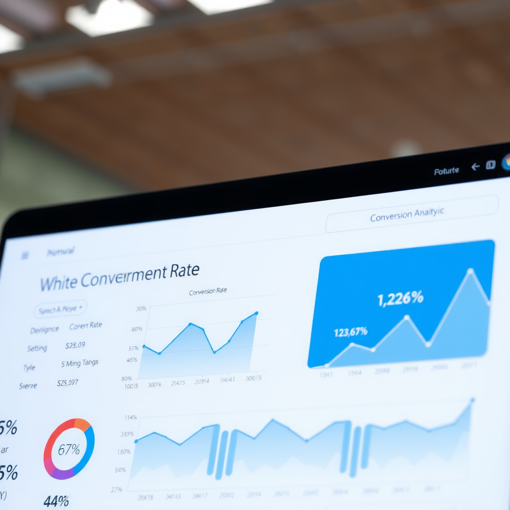
Key Metrics Before Redesign
Conversion Rate
1.2%
Average Order Value
$87
Cart Abandonment
73%
Mobile Load Time
6.8s
Our Strategic Approach
We began with comprehensive user research, conducting interviews with 45 customers and analyzing heatmaps and session recordings from over 10,000 user sessions. This research revealed critical insights that would guide our design decisions.

Phase 1: Performance Optimization
Speed is conversion. We implemented aggressive performance optimizations that reduced mobile load times from 6.8 seconds to 1.9 seconds. This included:
- Implementing lazy loading for images and implementing next-gen image formats
- Optimizing critical rendering path and eliminating render-blocking resources
- Implementing a content delivery network for static assets
- Reducing JavaScript bundle size by 68% through code splitting
- Implementing browser caching strategies and compression
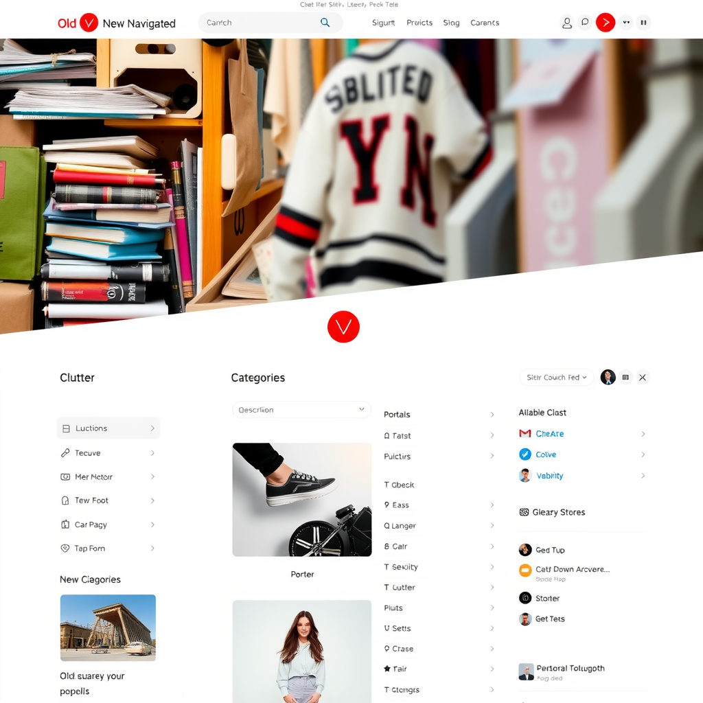
Phase 2: Navigation Redesign
Our research showed that 62% of users abandoned their search within the first two minutes due to navigation frustration. We completely restructured the information architecture, reducing the average clicks to product from 3.2 to 1.4. The new navigation featured:
- Mega menu with visual category previews and popular products
- Intelligent search with autocomplete and product suggestions
- Breadcrumb navigation for easy backtracking
- Sticky header with persistent cart access
- Smart filtering system with real-time results
Phase 3: Mobile-First Redesign
With 67% of traffic coming from mobile devices, we adopted a mobile-first approach. Every element was designed for touch interaction, with minimum tap targets of 44x44 pixels. The responsive design ensured perfect rendering across all device sizes, with special attention to:
- Thumb-friendly navigation placement
- Readable typography without zooming (minimum 16px font size)
- Simplified forms with smart input types
- One-tap actions for common tasks
- Progressive disclosure to reduce cognitive load
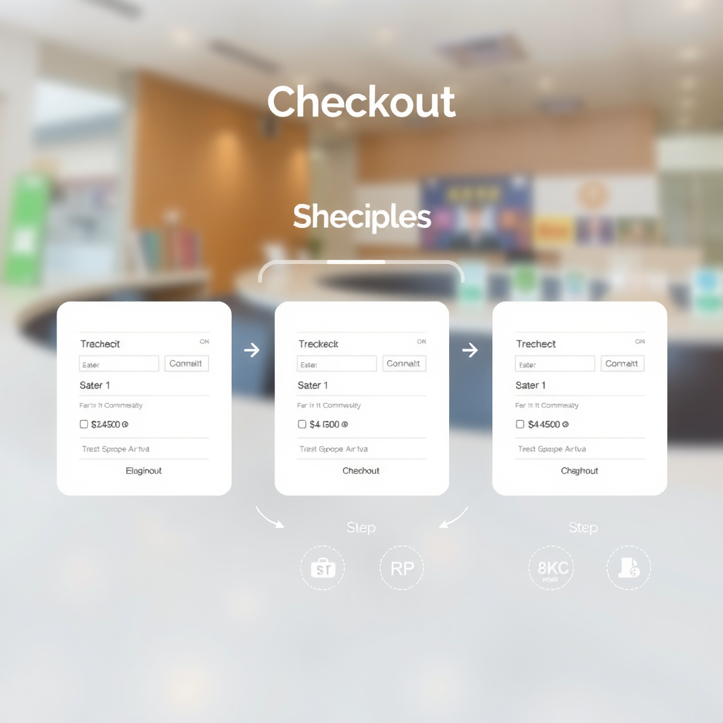
Phase 4: Checkout Optimization
The checkout process was the biggest conversion killer. We reduced it from seven steps to three, implementing a single-page checkout with clear progress indicators. Key improvements included:
- Guest checkout option (no forced account creation)
- Address autocomplete and validation
- Multiple payment options including digital wallets
- Real-time shipping cost calculation
- Clear security badges and trust signals
- Inline error validation with helpful messages
Phase 5: Trust and Social Proof
Building trust was essential for conversion. We strategically placed trust signals throughout the customer journey:
- Customer reviews with photos on every product page
- Real-time purchase notifications showing recent orders
- Detailed return policy and money-back guarantee
- Security certifications and payment badges
- Customer testimonials with verified purchase indicators
- Live chat support with average response time displayed
The Results
After three months of implementation and optimization, the results exceeded our expectations. The transformation was dramatic and measurable across every key performance indicator.
Key Metrics After Redesign
Conversion Rate
5.3%
↑ 340% increase
Average Order Value
$124
↑ 43% increase
Cart Abandonment
41%
↓ 44% decrease
Mobile Load Time
1.9s
↓ 72% decrease
Revenue Impact
$1.8M
Additional annual revenue generated
Key Takeaways
This project reinforced several critical principles that we apply to every Smoobu Design engagement:
1. Performance is Non-Negotiable
Every second of load time costs conversions. Our 72% reduction in mobile load time directly contributed to the conversion rate increase. Users expect instant gratification, and slow sites lose sales.
2. Mobile-First is Essential
With mobile traffic dominating, designing for mobile first ensures the best experience for the majority of users. Desktop becomes an enhancement, not the primary focus.
3. Simplify the Path to Purchase
Every unnecessary click, form field, or decision point increases friction. Reducing checkout from seven steps to three had an immediate impact on cart abandonment rates.
4. Trust Signals Drive Conversions
Strategic placement of reviews, security badges, and social proof throughout the customer journey builds confidence and reduces purchase anxiety, especially for first-time buyers.
5. Data-Driven Design Wins
User research, analytics, and testing informed every design decision. Beautiful design means nothing if it doesn't solve real user problems and drive business results.

Looking Forward
The success of this project demonstrates what's possible when strategic design thinking meets technical excellence. Our client has seen sustained growth in the months following launch, with conversion rates stabilizing at 5.1% and continuing to climb as we implement ongoing optimizations.
The additional $1.8 million in annual revenue has allowed our client to invest in inventory expansion, marketing initiatives, and customer service improvements, creating a positive feedback loop of growth and customer satisfaction.
"Working with Smoobu Design transformed our business. The 340% increase in conversion rates exceeded our wildest expectations. More importantly, they taught us to think about our website as a strategic business asset, not just a digital brochure. The ROI has been extraordinary."
— Sarah Mitchell, CEO
At Smoobu Design, we believe every business deserves a website that works as hard as they do. This case study represents our commitment to delivering measurable results through thoughtful design, technical excellence, and unwavering focus on user experience.
If your website isn't converting visitors into customers at the rate you need, we'd love to explore how strategic design can transform your business results. The potential for growth is there—it just needs the right approach to unlock it.